Full Brand System and Experience
Liquid Lightning
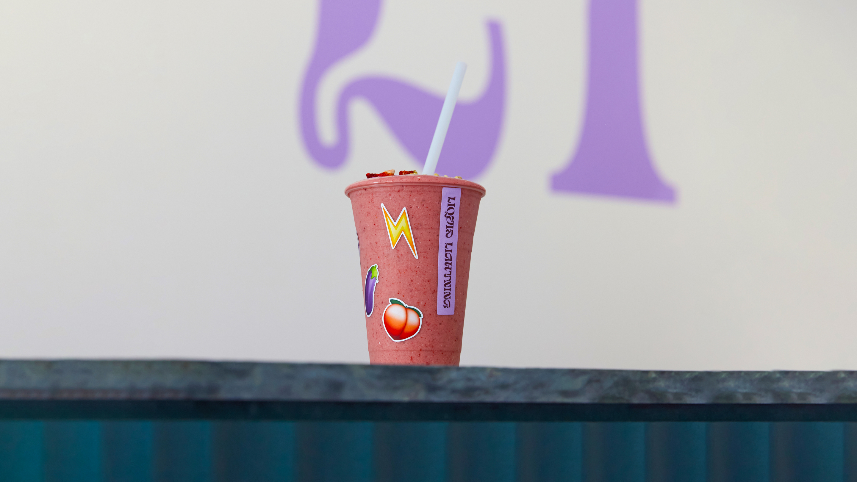
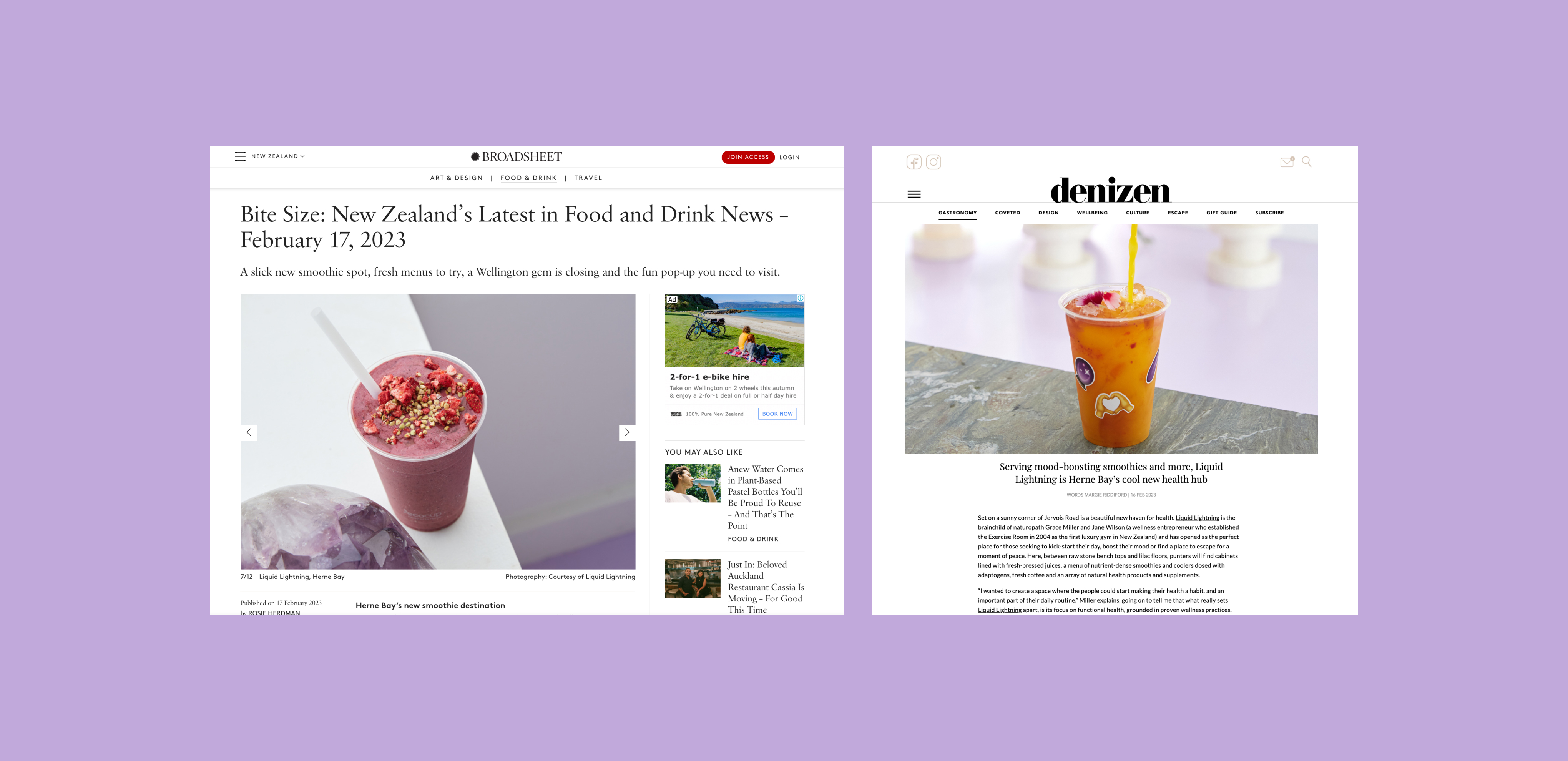
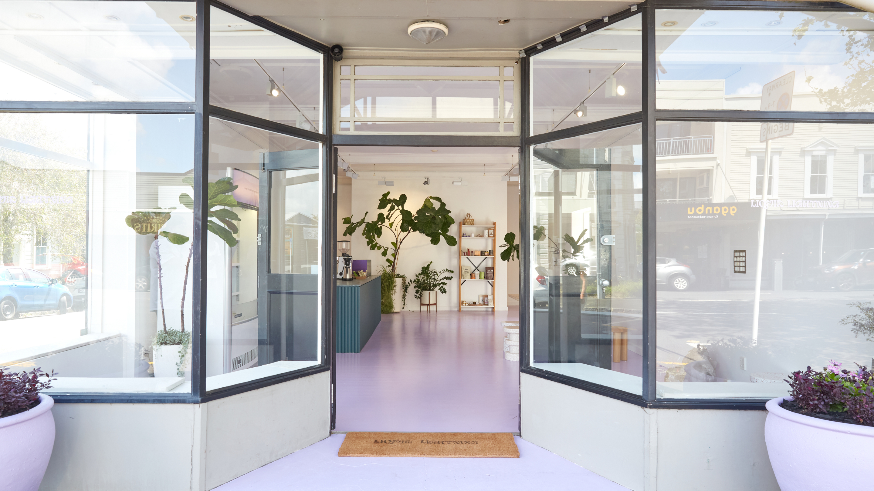
Liquid Lightning is a new health and wellness hub with a strong focus on researched and proven contemporary wellness practices that encourage and support your wellbeing. Serving cold pressed juices, fresh smoothies and adaptogenic beverages, Liquid Lightning will ignite the body with a feeling of clarity and calmness.
Founders Grace and Jane came to Mark by South for a full system and experience.
Services
- Brand Identity
- Social Media Strategy
- In-store Collateral & Menu Design
- Signage
- Photography
- Website
- PR
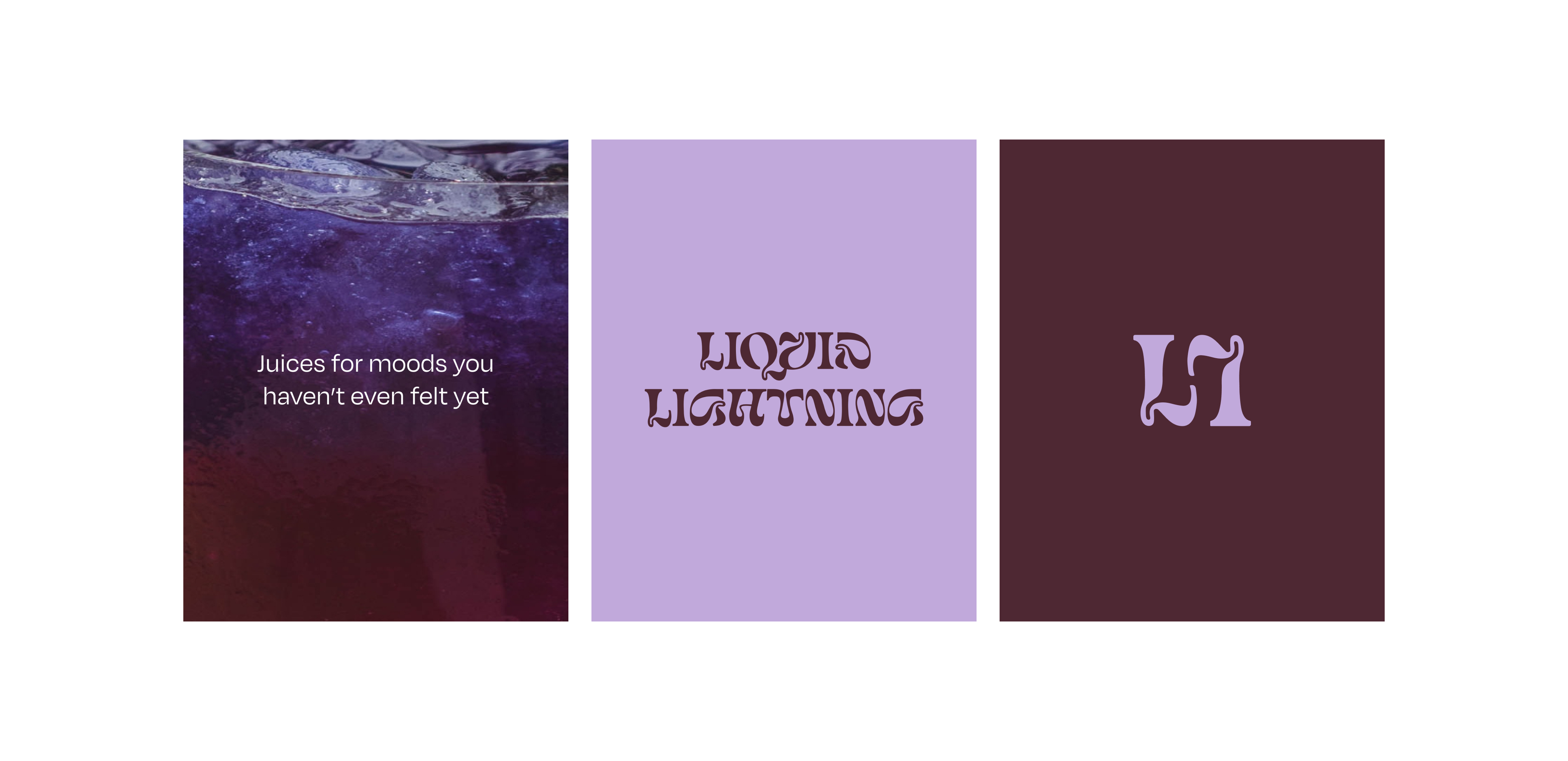
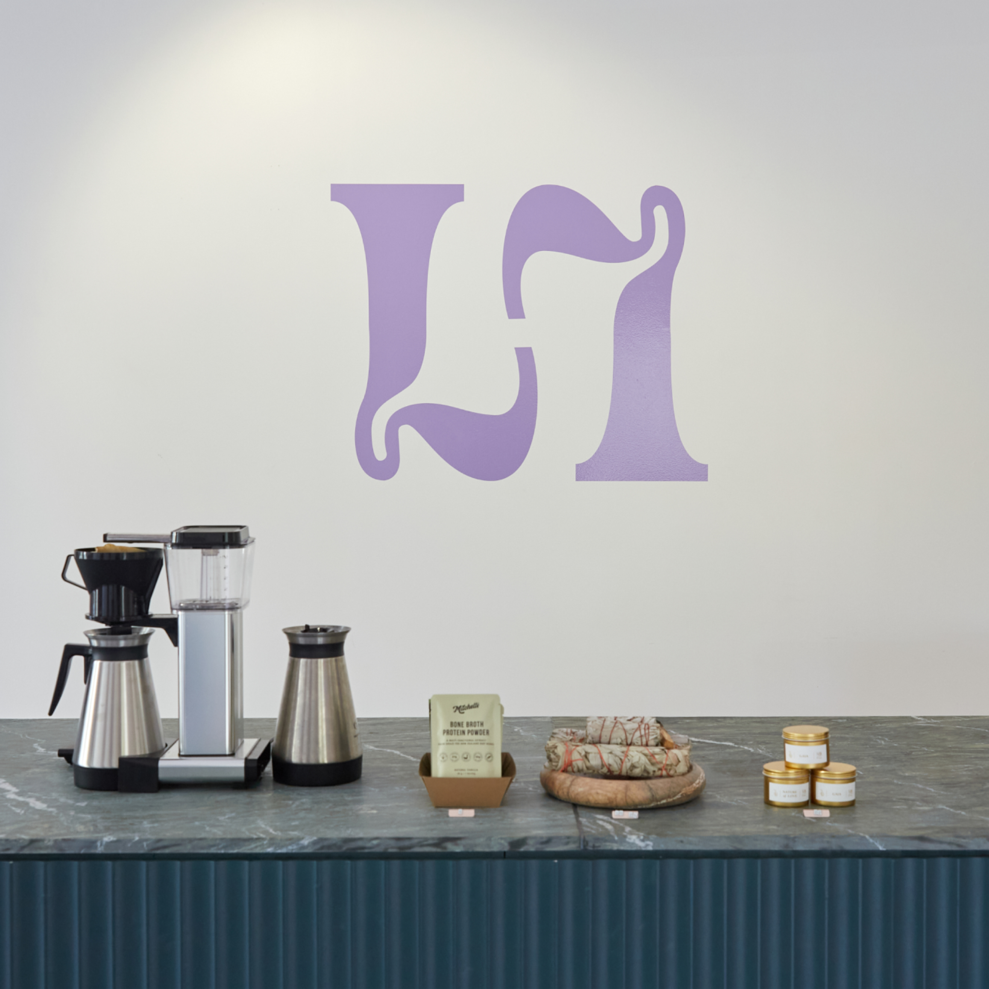
A lilac tone was chosen as the key colour, to align with the interior and set the foundations for the rest of the brand work. We selected an expressive fluid typeface for the logo, Humankind, that represents the concept of liquid moving.


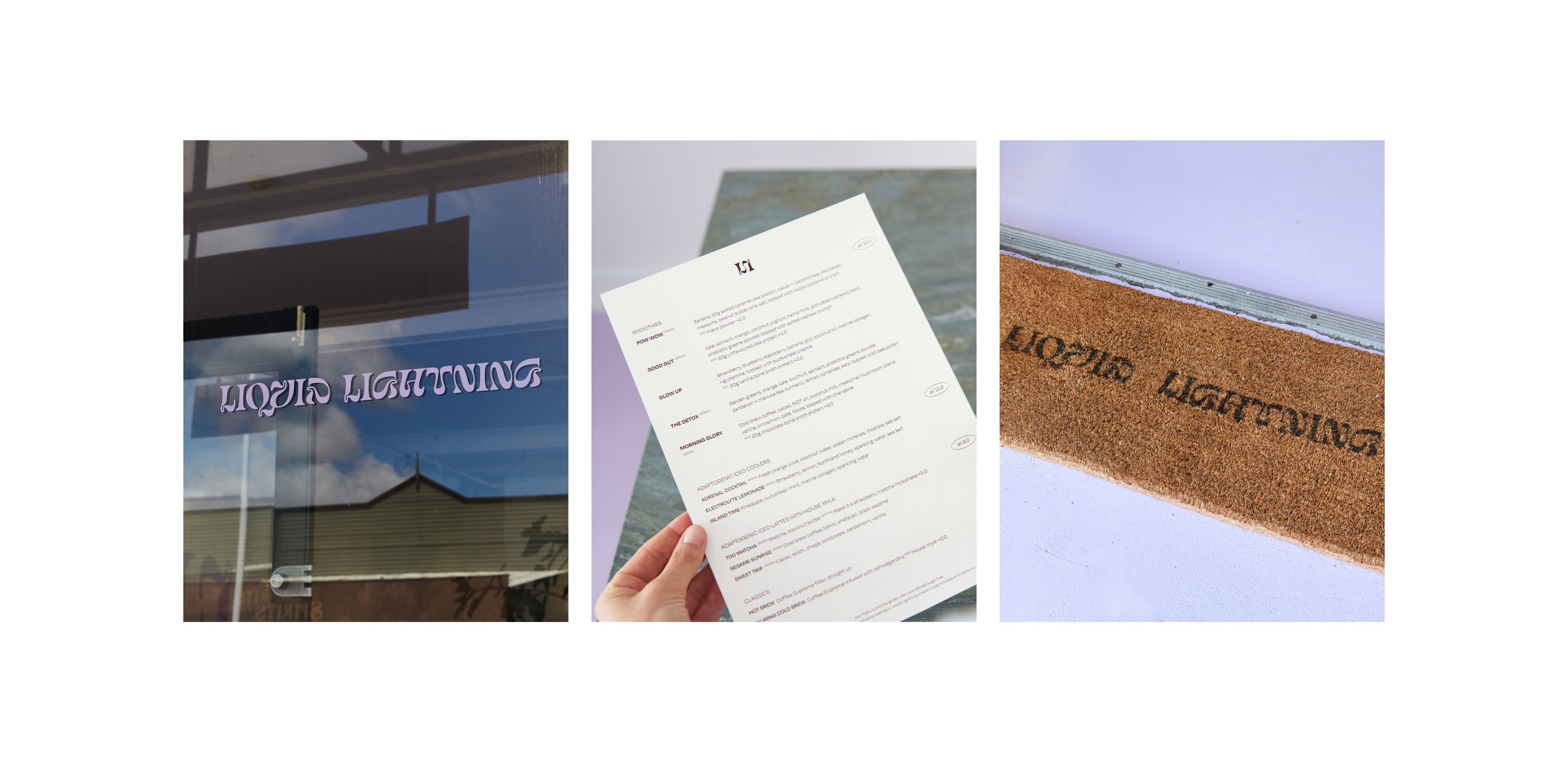
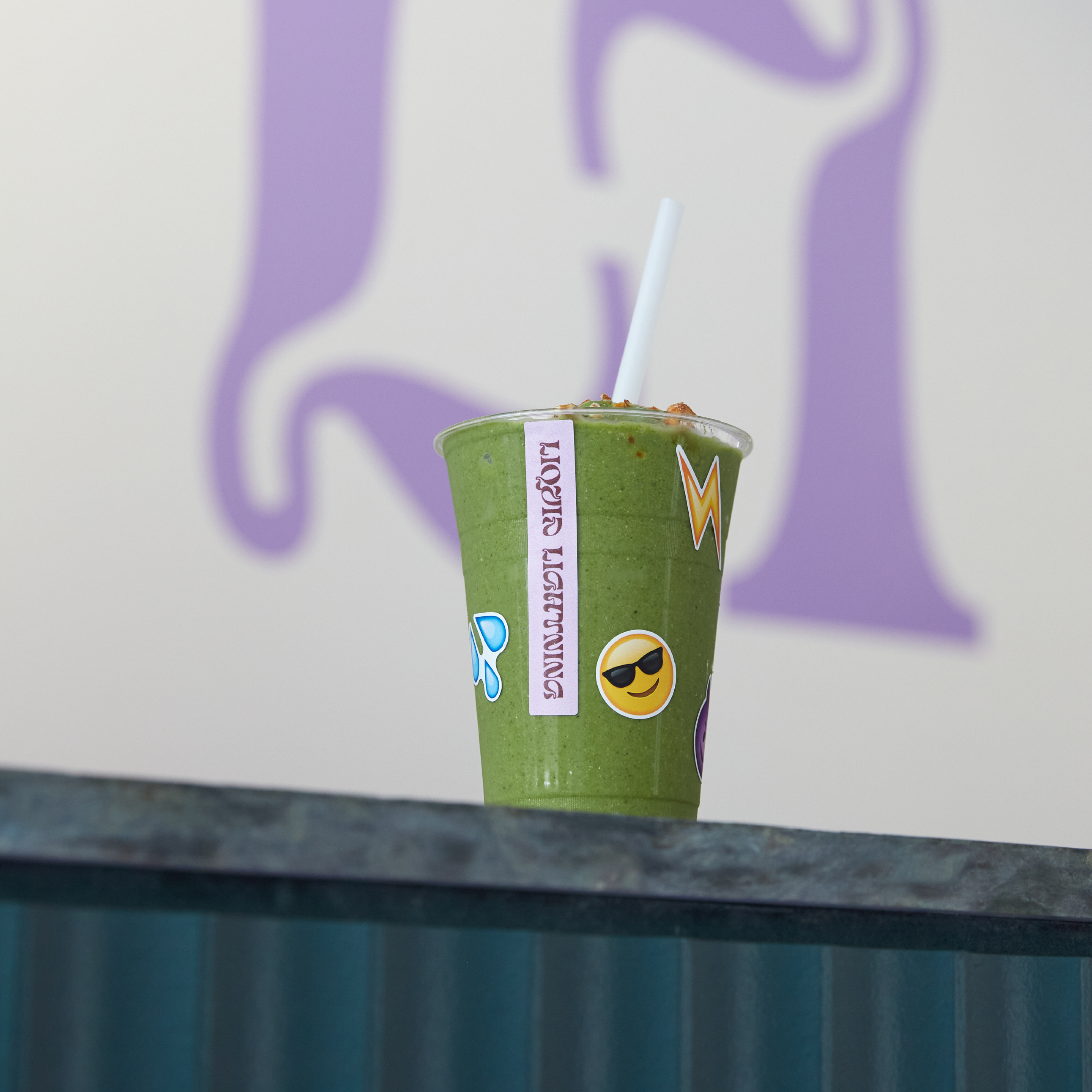
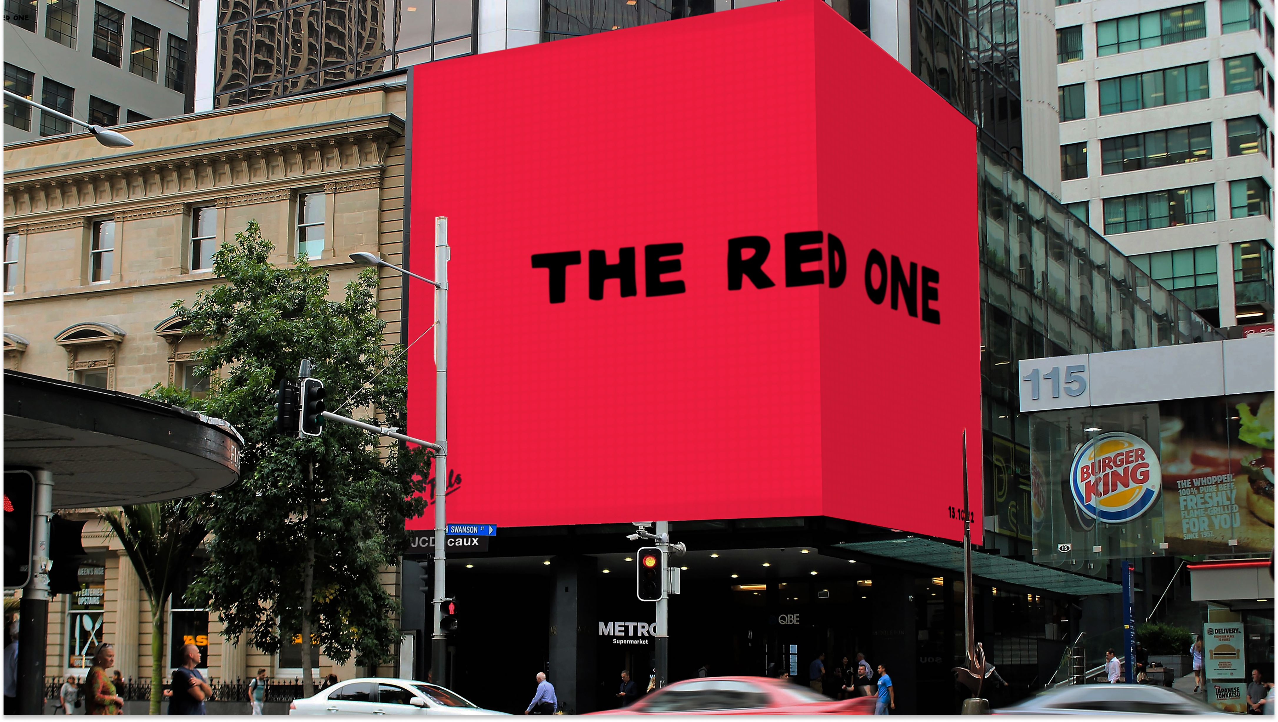
Some additional quirky elements were added to the rollout to reflect Liquid Lightning’s playful tone of voice – including curated emoji stickers and a fully reflective street sign.